Segula Customs
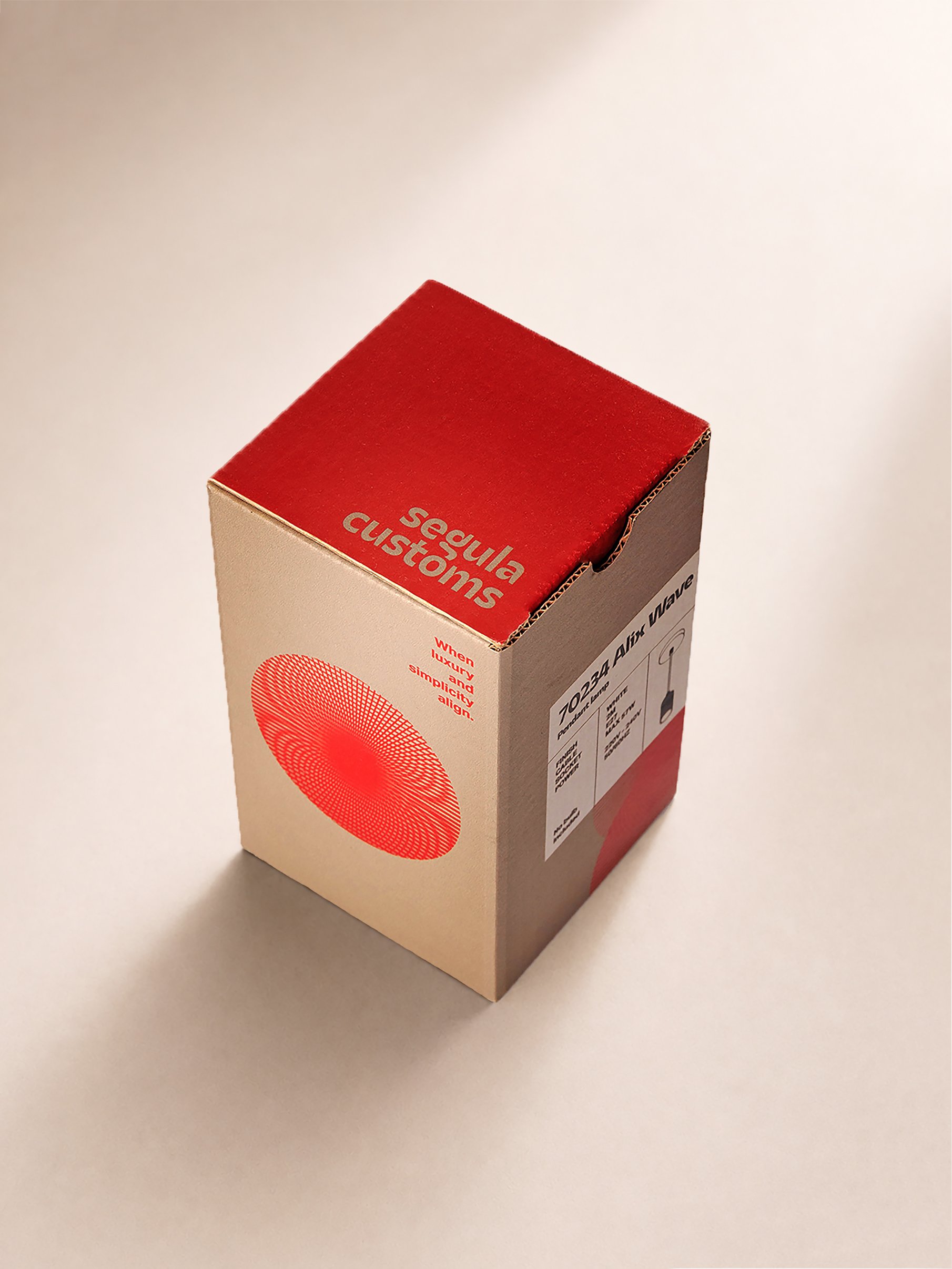
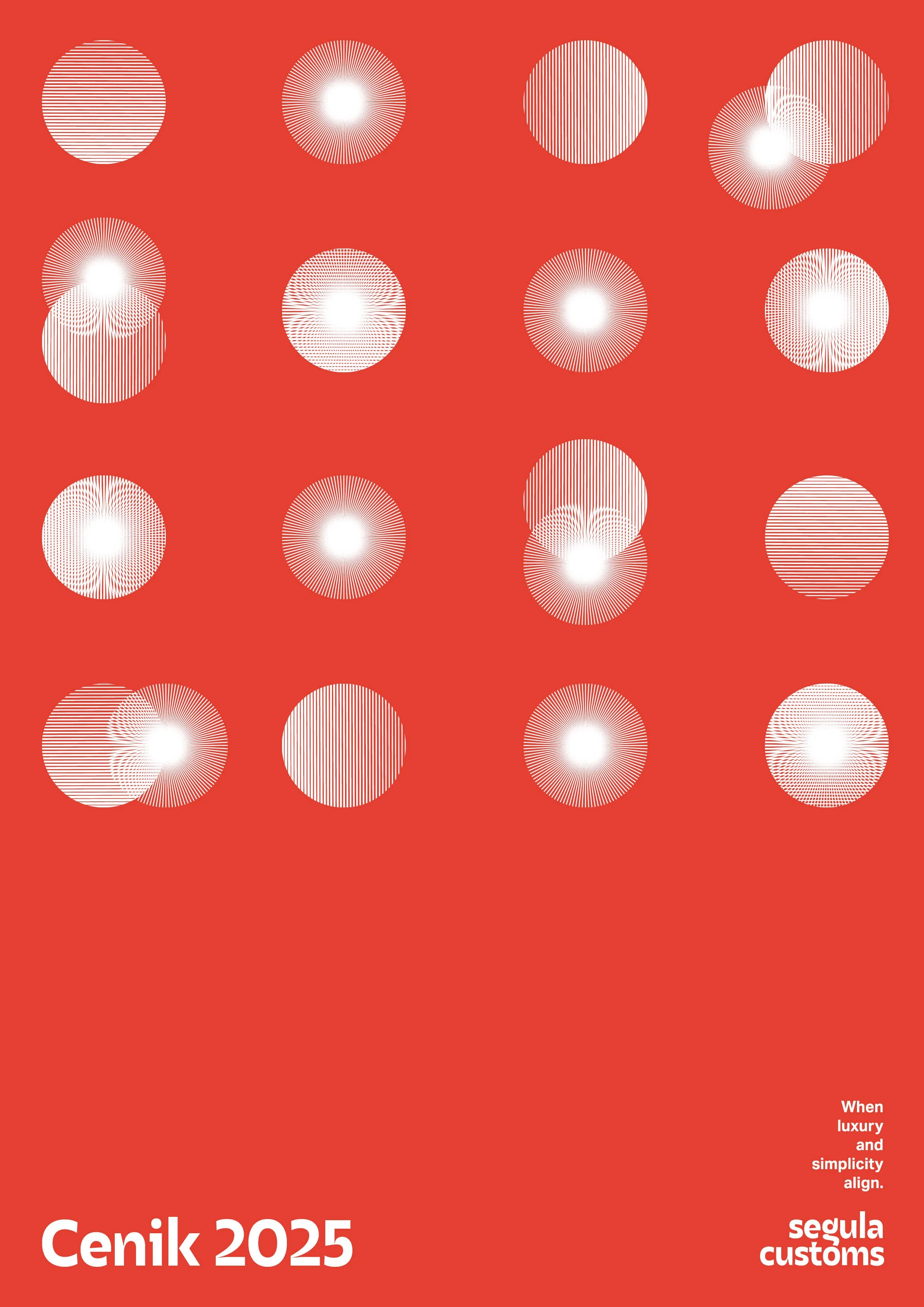
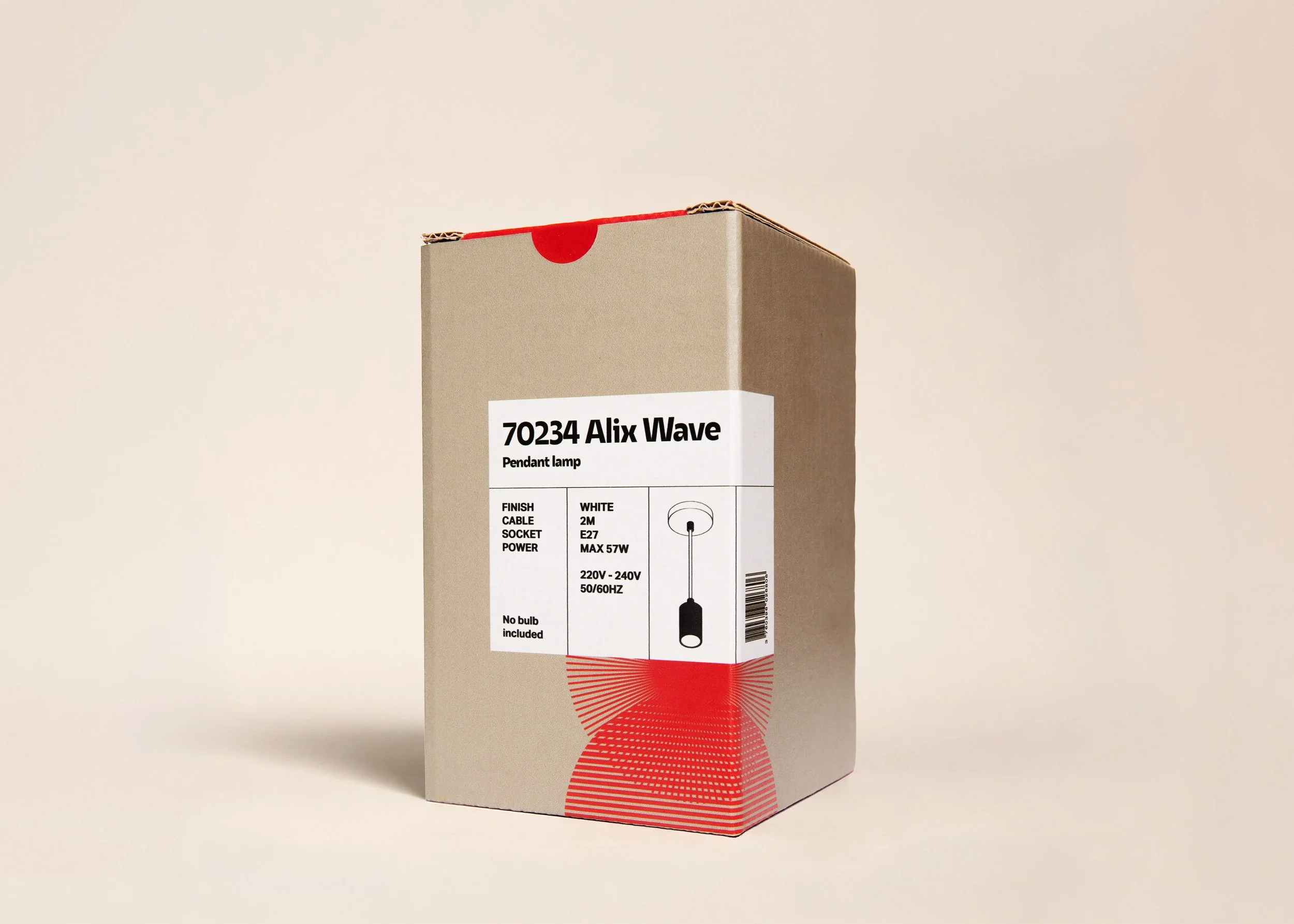
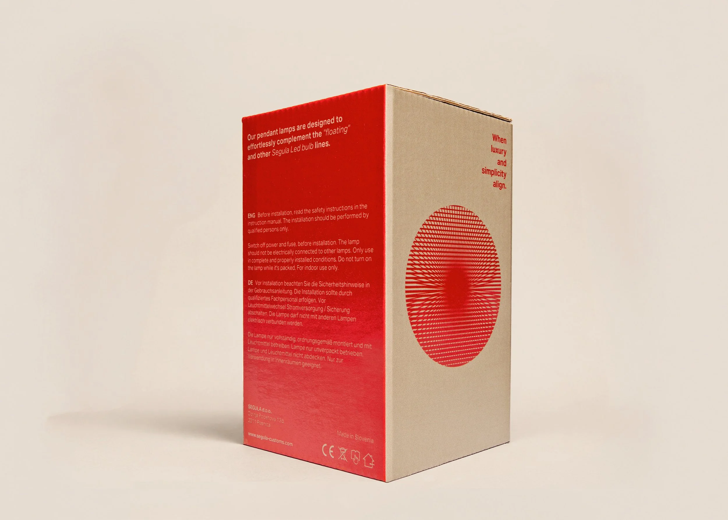
The visual identity is based on one simple design element: the line, inspired by the movement of light and optical illusion.
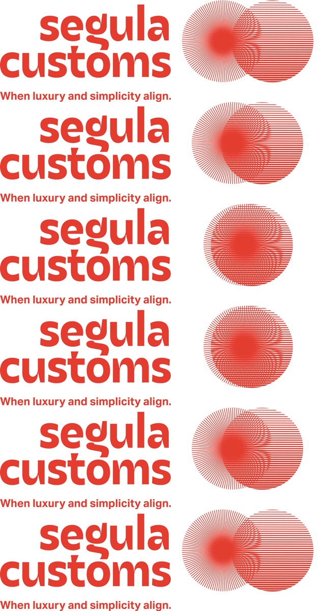
The logo is inspired by the signature line pattern found on the brand's products, which creates the illusion of a curved shape. This idea is reflected in the custom-designed letter “g” and the elegant look of the high-contrast typography.
The concept continues through graphic elements based on the same line pattern. A symbol created from two simple geometric shapes represents the brand's tagline: “When luxury and simplicity align.”
I was selected as a finalist with this project for Zagreb Design Week 2025.